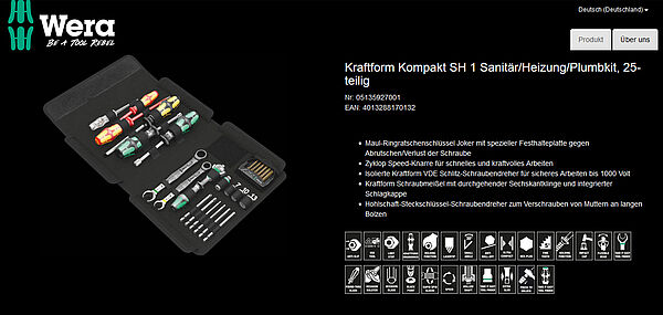
Wuppertal. The online presence of the screwdriving tool manufacturer Wera has received multiple awards. Now every online retailer can partly become a "Tool Rebel" as well. Wera is now working with loadbee, the IT platform for online product profiles, to ensure the best brand and product communication across all distributors. Retailers only have to integrate a plug-in once into their online shop and they receive full product information for all tools with the look and feel of Wera directly in their online shop.
Detailed product information in real time
"With the Tool Rebels, Wera shows how unusual screwdriving tools can be. Thanks to our online product platform, we can fully automatically distribute our products and brands to our dealers into their respective online product portals", explains Detlef Seyfarth, Marketing Manager at Wera. “In addition, the end user will find detailed and complete information about our products." The retailer has less data maintenance and always has the most up-to-date product information on their website.”
To enable Wera to display its content directly in the product details pages of the retail partners' online shops, traders simply enter a multiline piece of code into their Java Script using copy and paste. From then on, the complete product data flows into the online shop in real time. Wera has created all the information for each individual product centrally on our special IT platform, so that the traders can benefit from the Wera content in their own online shops.
Always up to date
The so-called "digital product profile" is the final layout of rich content such as videos, pictures, text etc., in Wera’s corporate design. As soon as the manufacturer publishes a change for a product, for example a newly updated price, this product information will also be displayed in other online shops.
This is a true win-win situation for industry and commerce: The shop operator has less data maintenance and always has the most up-to-date product information for their customers, and Wera reaches their shared customers with its own look and feel. "With our product profiles on the platform, together with our trading partners, we best assist our joint customers with their online presence," emphasizes Detlef Seyfarth. "Integrating product information was not always easy for distributors. This system can now remedy this situation."


