
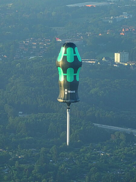
Wuppertal. The Tool Rebels of the screwdriver manufacturer Wera are generally known for their passion to question standards and to present unusual ideas. Now Wera has even progressed so far that screwdrivers grow into the sky!
The company has built a hot air balloon in the shape of a screwdriver with a total height of 65 meters and will now be able to rock the sky at many events and across several cities in Europe. A real eye-catcher is the long screwdriver blade, which is situated under the basket.
Wera’s brand awareness fires up in a very unusual way in the truest sense of the word. For all those who rub their eyes in amazement, rest assured that the screwdriver is indeed genuine, even if you cannot screwdrive with it.
Dates and details can be found on Facebook: https://www.facebook.com/weratoolrebels/